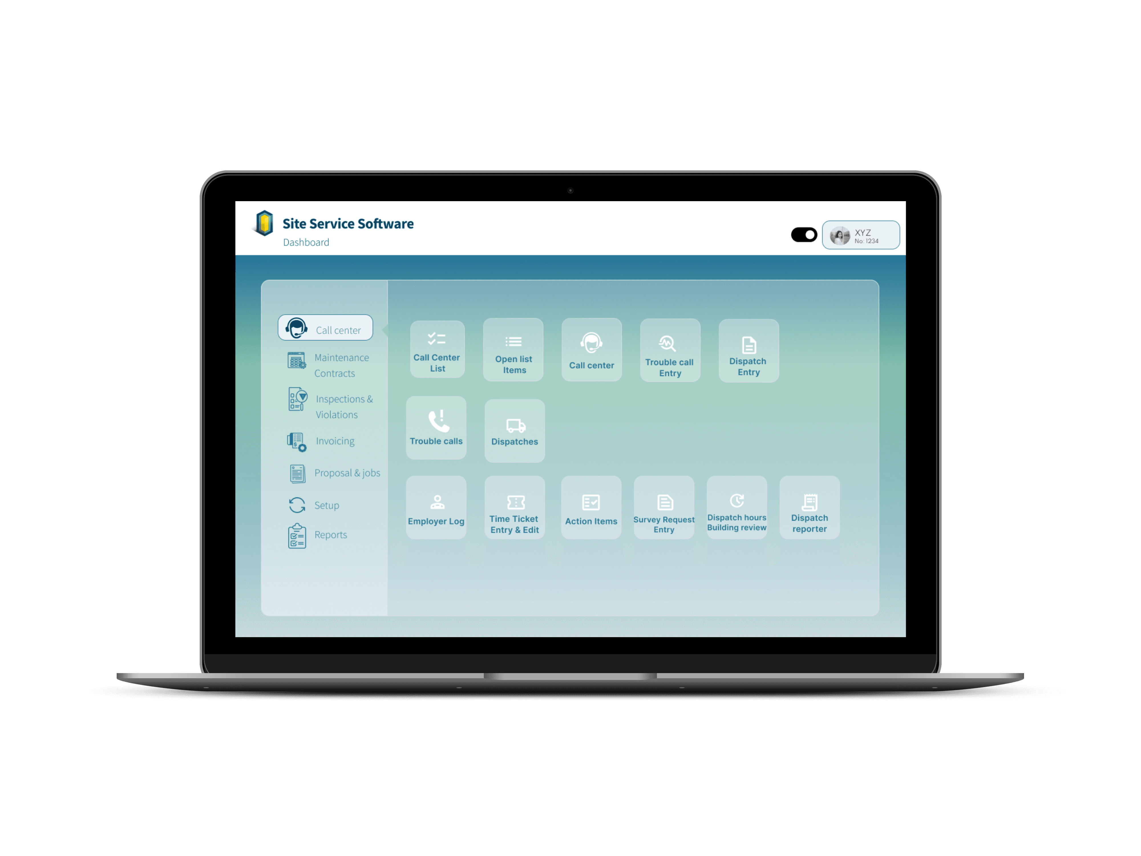
DASHBOARD
Easily plan and manage training sessions across departments, scenarios, and groups to ensure structured and consistent training delivery.

Strengthened collaboration by translating complex operational needs into clear, usable UI decisions, enabling smoother communication between designers,
developers, and product stakeholders.
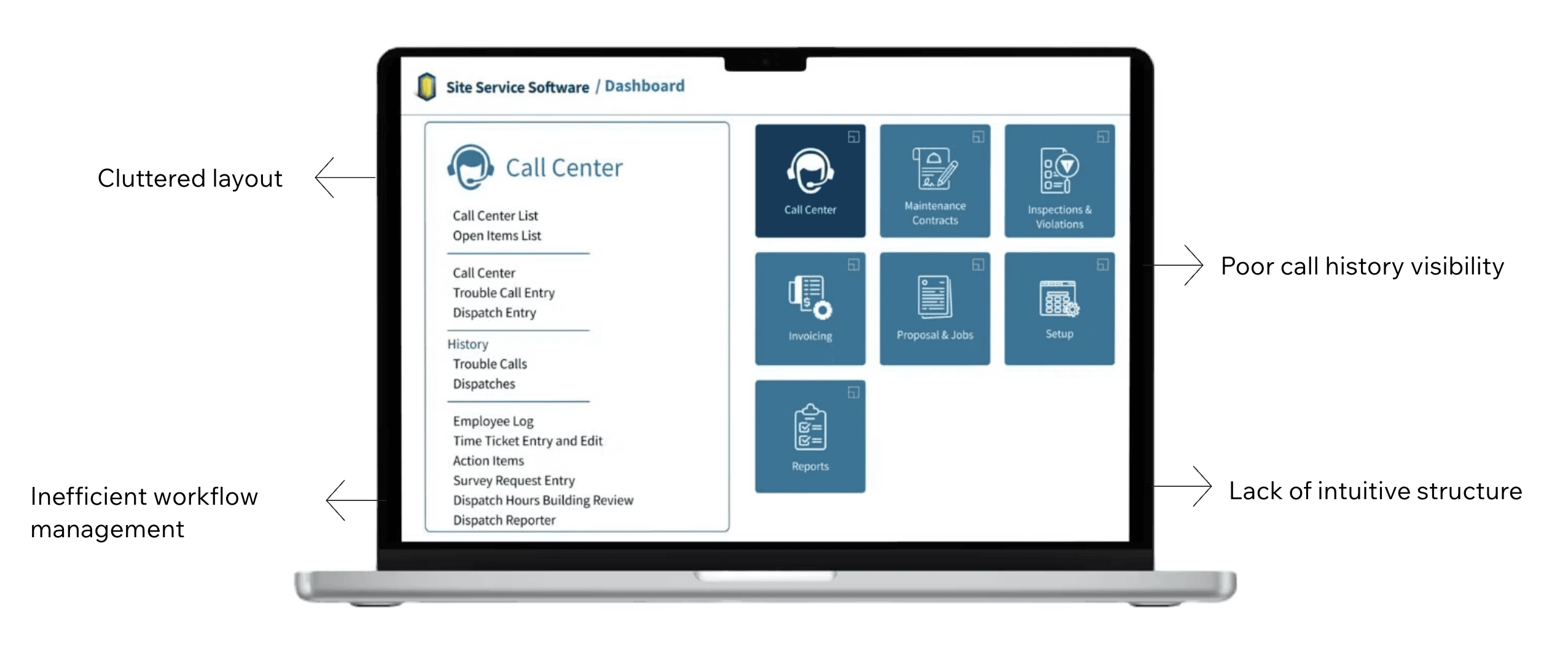
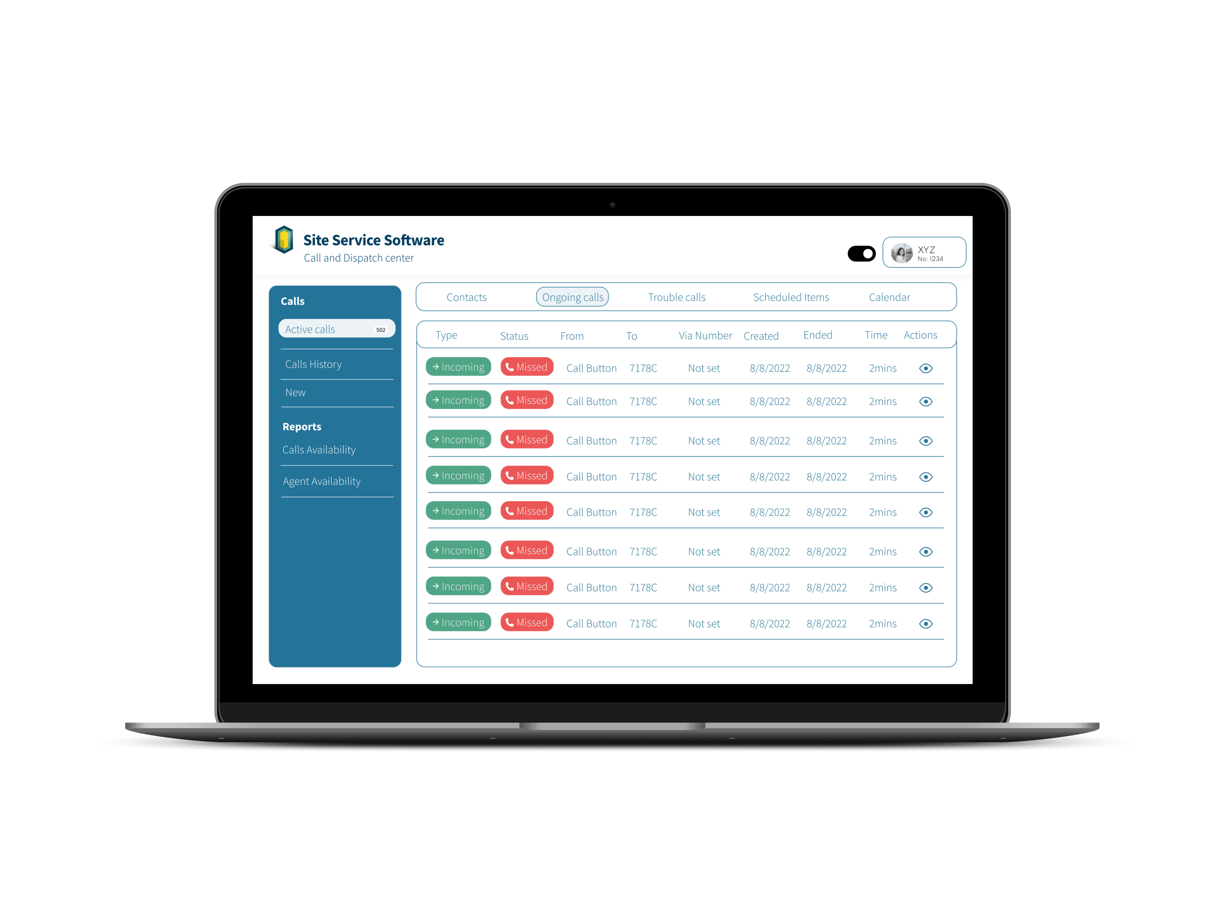
Streamlined Call Handling
Delivered a redesigned system that improves clarity and reduces workflow friction during urgent calls, helping agents quickly understand situations and take action
with greater confidence.
Reduced Cognitive Load
Multi-Mode UI Support
Critical call details are surfaced upfront, reducing time spent searching and switching between views.
Agents can review previous calls and related entries quickly, supporting faster context building.
Improved Call History
Visibility
Clear hierarchy, spacing, and grouping help agents focus on the next best action under pressure.
Designed multiple visual modes (Light → Glassmorphism) while maintaining readability and clarity.
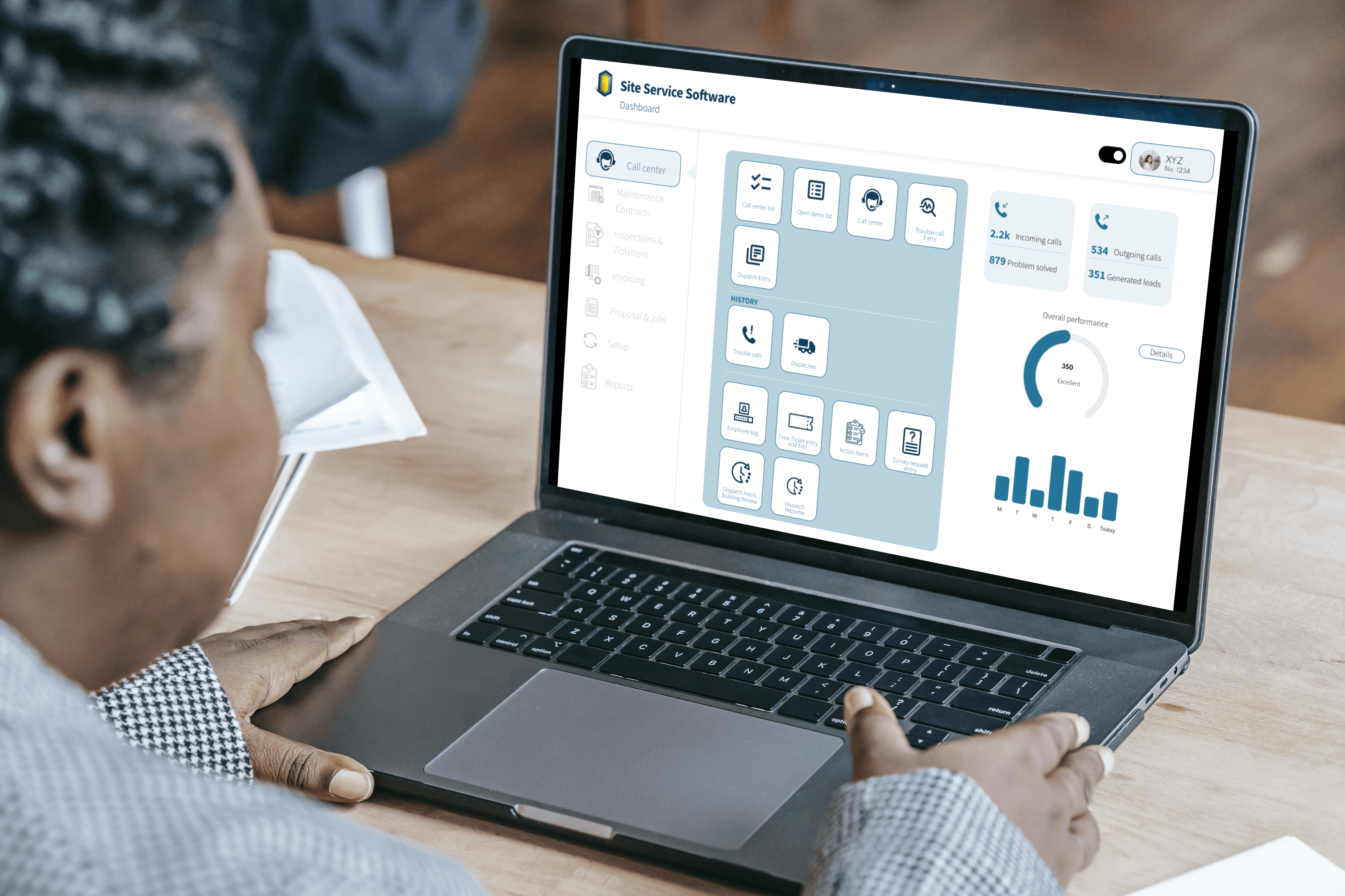
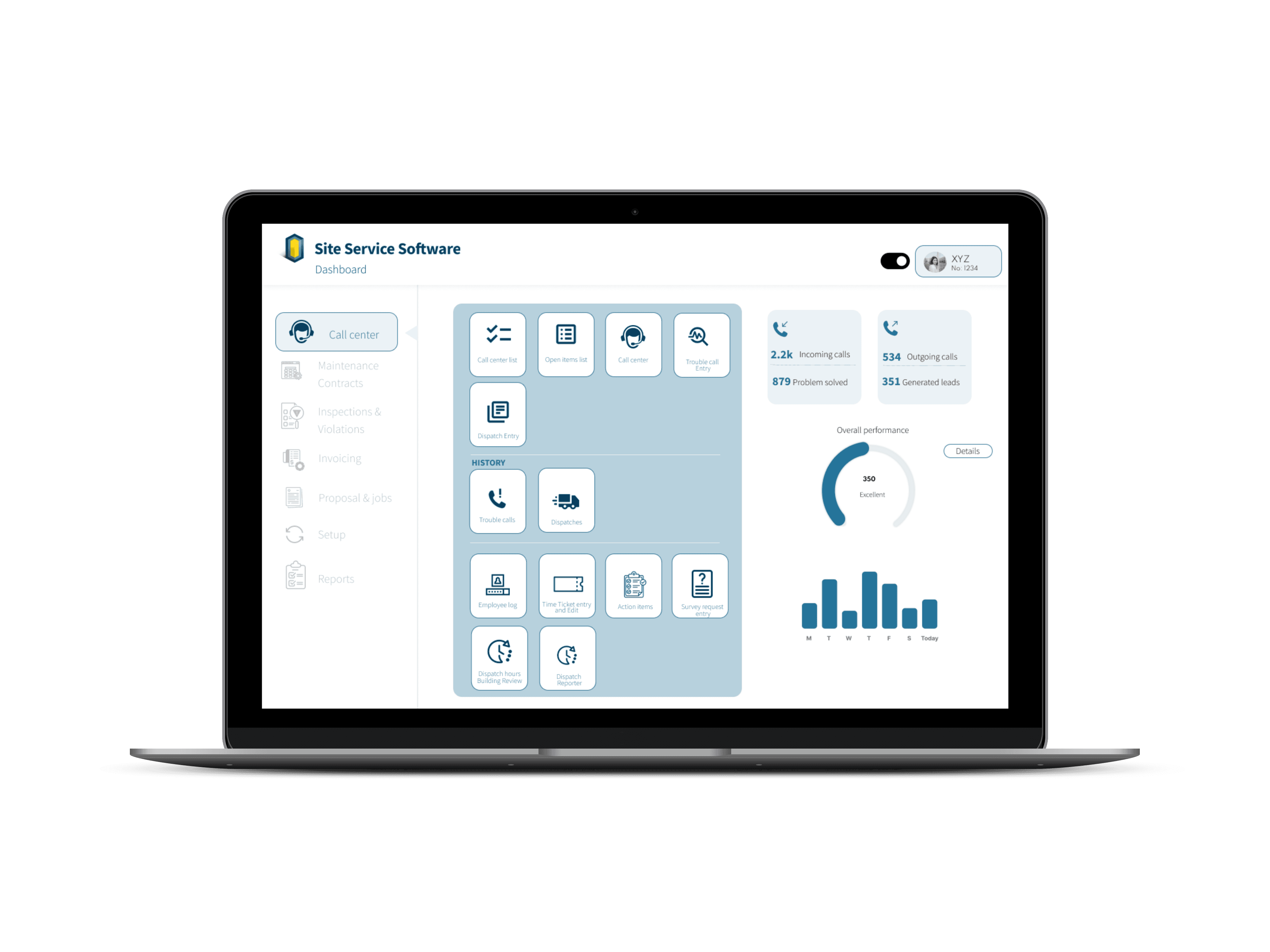
The redesigned interface provides operators with a clearer, calmer workspace during emergencies, making it easier to take action quickly and accurately.
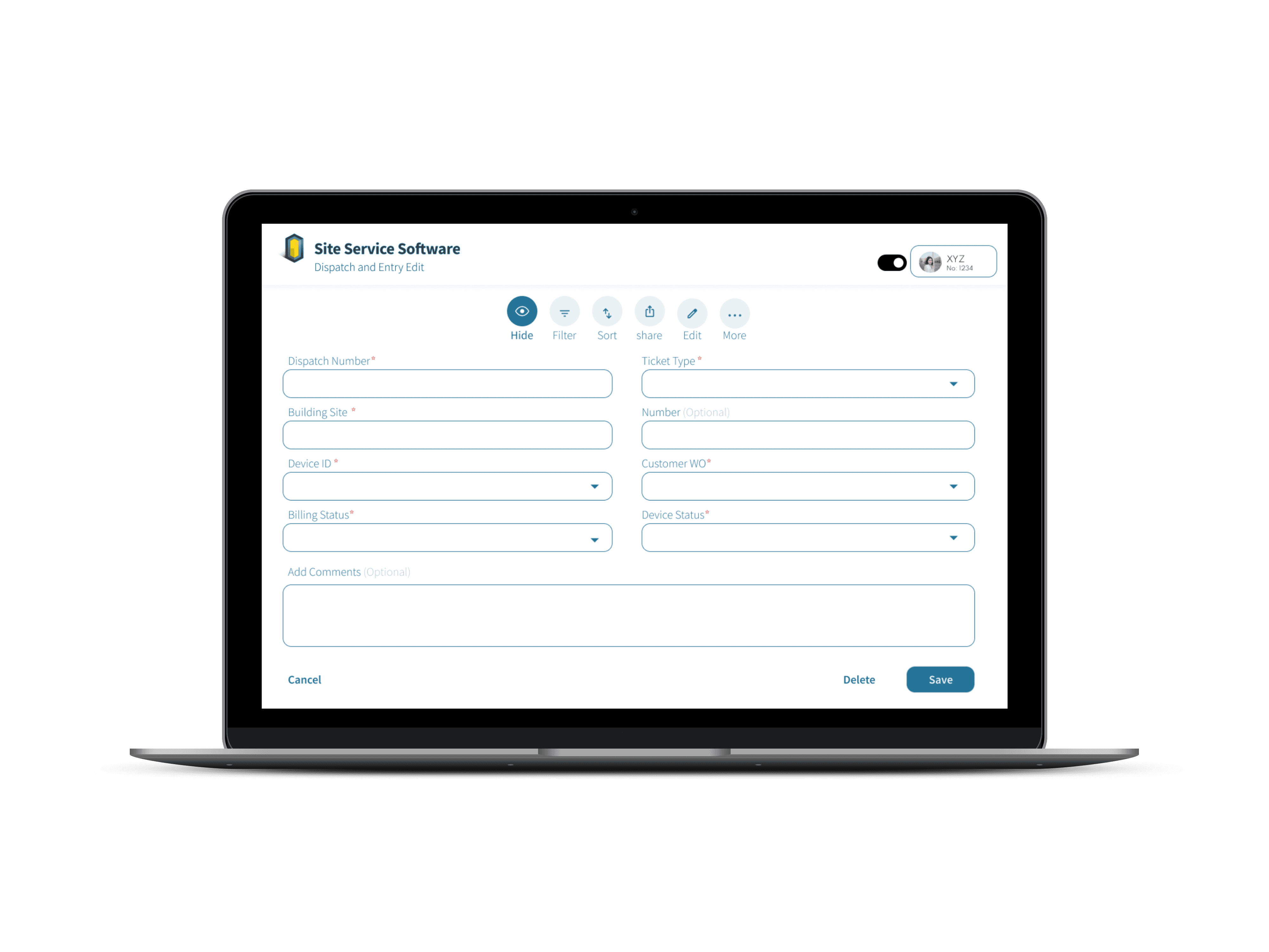
In emergency call scenarios, agents must process multiple types of critical information at once: caller details, building/site context, device status, timestamps, and dispatch
actions. Even small delays or unclear layouts can slow response time and increase stress.
Created reusable components and consistent interaction patterns that support future feature expansion and ensure long-term maintainability of the system.
ROLE
DURATION
UX Designer
14 Weeks
I reviewed the existing dashboard and workflows to identify bottlenecks and areas where agents experienced friction during emergency calls.
By mapping key tasks involved in call handling, I gained a clearer understanding of how agents navigate information under pressure. This process helped me
distinguish which details needed to be surfaced immediately, such as caller information and active incidents, and which could be treated as secondary, informing
decisions around hierarchy and layout.
I reorganized the content hierarchy around the agent’s core priorities, understanding who is involved, where the incident is occurring, what the situation is,
what needs attention now, and the next action to take, ensuring critical information is immediately visible. I also simplified navigation patterns so agents could move
quickly between call details, logs, and dispatch actions, reducing friction and supporting faster decision-making during high-pressure situations.
I designed high-fidelity screens in Figma to translate the new workflow into a clear and intuitive interface. To maintain consistency and support future scalability,
I developed reusable UI components that could be applied across the system. Throughout the design, I paid close attention to layout and typography to ensure
information could be scanned quickly, helping agents process critical details efficiently during emergencies.
Throughout the iteration phase, I collaborated closely with stakeholders and developers to validate the feasibility of design decisions and ensure alignment with
technical constraints. I incorporated feedback from discussions and reviews to refine the screens, making them better support real operational workflows. The
interface now addresses practical needs and works effectively in high-pressure environments.
Partnered on designing a behavioral VR training system aimed at improving preparedness and decision-making through immersive simulations and performance analytics.
Background
This project introduced a more structured and usability-focused approach to managing emergency call workflows, helping teams move from fragmented processes toward clearer, more efficient operations. By simplifying interfaces, aligning design with real operational needs, and establishing scalable patterns, the redesign supports faster decision-making and sets a strong foundation for future improvements.
Results
Improved Workflow Clarity
Scalable Design Foundation
Stronger Stakeholder
Alignment
High-Reliability Operations Dashboard for Emergency Response
COMPANY
Site Service Software
Revamping the Elevator Emergency Call & Dispatch
Interface
Project description
Problem Statement
Process
Site Service Software supports building operators and call center agents in handling elevator emergency calls and dispatching help quickly. The existing interface was functional but visually cluttered and difficult to navigate during high-pressure situations. The goal of this redesign was to streamline emergency workflows, reduce cognitive load, improve visibility into call history, and deliver a cleaner UI that supports fast decision-making in real time.
"How might we redesign the call center dashboard to give agents clear visibility of call histories, streamline workflows, and enhance operational efficiency?"
Background
Research & Discovery
UX Strategy & Information
Architecture
UI Design & Component
System
Iteration & Alignment
Website Analysis
Solution