Designing a Behavioral VR Training Platform for Law Enforcement from Research to MVP
How I led end-to-end UX for a VR training system used by law enforcement, conducting officer interviews, uncovering a critical gap in post-session feedback, and designing a data-driven platform that shaped GravityDrive's entire MVP feature set.
GravityDrive
Before this project, GravityDrive had VR hardware but no structured way to capture, evaluate, or act on what happened inside a training session. Officers trained, but instructors couldn't measure performance, review decisions, or provide targeted feedback after the fact. My research uncovered that gap, and my designs directly answered it. The platform I designed gave law enforcement trainers a structured, data-driven system for evaluating officer behavior under pressure, replacing informal observation with repeatable, evidence-based assessment.
Law enforcement training is one of the highest-stakes domains in UX design. Officers practice critical scenarios, conflict resolution, crisis response, and use-of-force decisions in VR simulations. But when the headset came off, there was almost nothing to learn from.
Instructors observed sessions in real time and took handwritten notes. There was no playback. No structured data. No way to show an officer exactly where their decision-making broke down, or compare performance across sessions over time.
The gap wasn't in the training itself; it was in everything that happened after it. Debriefs were inconsistent. Feedback was subjective. And there was no mechanism to track whether officers were actually improving.
Feedback is the training. Officers told me that the debrief, what happened after the simulation, was often more valuable than the simulation itself. But without structured tools, debriefs were inconsistent, overly subjective, and heavily dependent on the individual instructor's memory and style.
I started with people, not screens. Before touching Figma, I spent the first phase of this project conducting in-depth interviews with law enforcement professionals, trainers, instructors, and officers to understand how training actually worked in practice, not just in theory. What I found challenged the original brief. GravityDrive hypothesized that the primary problem was scenario quality. My research told a different story: the training itself wasn't the bottleneck. The bottleneck was what happened in the 20 minutes after it.
Performance data existed but was invisible. The VR hardware was already capturing behavioral signals, movement, reaction time, and decision points, but none of it was surfaced to instructors or trainees in a meaningful way. The data was there. The interface wasn't.
Playback was the missing feature. Every officer I spoke to mentioned, unprompted, that they wanted to be able to watch themselves back. See their own decision points. Compare their responses to the ideal. This was the single most consistent request across all interviews, and it had never been built.
With the research insights synthesized, I mapped the full information architecture of the platform, defining the four core modules that would need to exist: the Dashboard (session planning and overview), the After Action Report (structured post-session analysis), Session Playback (frame-by-frame review with instructor annotation), and the Scenario Library (browsable training content).
I started in low-fidelity, sketching the core flows before committing to visual design. The priority was information hierarchy: in a high-pressure training context, what does an instructor need to see first? What can wait? Every layout decision was driven by cognitive load; these are users who are already managing a lot, and adding to that burden was not an option.
I ran structured stakeholder reviews at three points in the process, after low-fi wireframes, after mid-fi prototypes, and after the first full hi-fi pass. Each round of surfaced concrete changes: the session playback scrubber needed larger tap targets for instructor use during debriefs; the scenario library needed filtering by department, not just scenario type; the dashboard needed a quick-action strip for common tasks that were being buried in the navigation.
Each round of feedback became a documented decision log, so when scope questions came up in engineering conversations, there was always a clear rationale.
Midway through research, I made a recommendation that changed the direction of the entire project: the primary user of this platform was not the officer in the VR headset. It was the instructor watching from the outside.
GravityDrive's original framing put the trainee at the center, the VR experience was the product. My research reframed it: the instructor's ability to evaluate, debrief, and adjust training was the actual value proposition. Without that, the VR was just entertainment.
This meant the platform needed to be built around instructor workflows first. The After Action Report, Session Playback, and Dashboard were all instructor-facing tools. The trainee-facing progress tracking was secondary.
That single reframe, who is the primary user? changed the feature priority order, the information architecture, and the core design language of the entire product. It's the kind of decision that only becomes visible through real user research, not assumptions.
Session Planning & Overview
Instructors manage multiple trainees across departments and scenarios. The Dashboard gives them a bird's-eye view, active sessions, upcoming schedules, trainee rosters, and recent performance summaries, all in one place. Designed to eliminate the 10–15 minutes of admin work that happened before every session.
Structured Behavioral Analysis
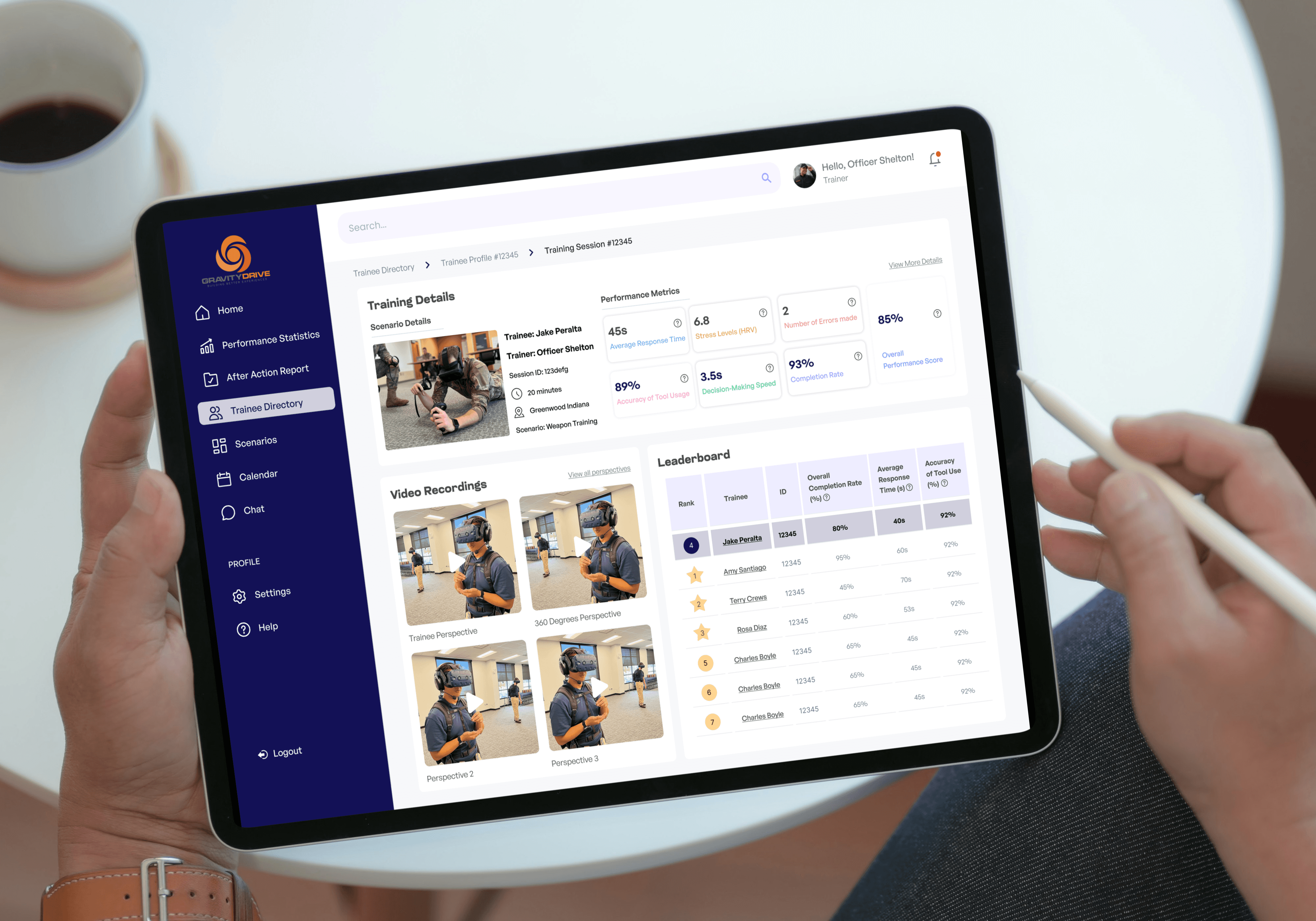
The After Action Report replaced handwritten instructor notes entirely. It surfaces behavioral signals, movement patterns, decision timestamps, reaction times, stress indicators, and scenario outcomes, in a structured, readable format built for immediate use in post-session debriefs. Every field maps to a specific question an instructor would ask: What did the officer do? When did they do it? Was it the right call?
Frame-by-Frame Review with Instructor Annotation
The most-requested feature from every officer I interviewed, and the one that had never existed in any VR training tool they had used. Instructors can scrub through a full session recording, pause at specific decision points, and drop timestamped annotations directly in the timeline. Officers can review their own sessions independently, watching exactly where their decision-making broke down and comparing their responses to the optimal path.
Browsable, Filterable Training Content
A centralized library of training scenarios, filterable by type, difficulty level, department, and skill focus. Instructors can build custom training programs by combining scenarios and assigning them to individual trainees or full groups. Designed to make session prep faster and more intentional, replacing the informal "pick whatever feels right" approach with a structured, goal-driven curriculum.
The designs I delivered became the foundation for GravityDrive's MVP. The four core modules, Dashboard, After Action Report, Session Playback, and Scenario Library, moved directly from production-aligned Figma handoff into the engineering build queue.
The After Action Report replaced informal instructor note-taking with a structured, repeatable evaluation format. Debriefs that previously relied on memory and subjective observation now had a consistent data layer, behavioral signals, decision timestamps, and scenario outcomes, that instructors could reference, annotate, and share.
Session Playback addressed the single most common request from every officer I interviewed. It gave trainees something they had never had: the ability to watch themselves, understand exactly where their decision-making broke down, and set measurable goals for the next session.
For GravityDrive, the platform validated their core product hypothesis: VR training hardware becomes significantly more valuable when paired with structured evaluation and reflection tools. The designs demonstrated that value clearly enough to move the product into its next funding stage.
If I were starting this project again, I would push for usability testing with actual law enforcement instructors earlier in the process, ideally at the wireframe stage rather than waiting for mid-fi prototypes. Some of the navigation decisions I made for the After Action Report required a full redesign pass after testing, which could have been avoided with one earlier session.
I would also have scoped the Scenario Library more tightly for the MVP. It became the most feature-heavy module and stretched the timeline in ways that put pressure on the final handoff sprint. A leaner v1, search and filter only, with tagging as a v2, would have let the higher-priority modules get more design iteration time.
That said, this project taught me more about designing for high-stakes users than anything else in my portfolio. When the users are law enforcement officers making decisions that have real-world consequences, every UX choice matters in a way that sharpens your judgment fast.
How might we leverage data from VR training equipment to develop a tracking and evaluation system that gives instructors structured, evidence-based insight into trainee performance and helps officers reflect, learn, and improve after every session?
#Key Insight 1
#Key Insight 3
#key Insight 2
Wireframing Approach
Stakeholder feedback loops
Feature 1: Dashboard
Feature 2: After Action Report
Feature 3: Session Back
Feature 4: Scenario Library
The Decision That Reframed the Brief
What Changed
Reflection
30 Weeks
Figma · FigJam · Miro
UX Designer


MVP
Research findings directly shaped the
feature set
30 Weeks
4
MVP
0
Research to production-aligned
handoff
Core features shipped to engineering
Research findings shaped the entire
feature set
Prior structured debrief tools before
this platform
Impact at a glance
The Problem
Research & Discovery
Information Architecture
How I Designed It
Final Designs
4
Core platform features designed
end-to-end