Design Health Inspector, A Figma Plugin I Built to Fix a Problem I Kept Running Into
I noticed that small accessibility issues, low-contrast text, missing fonts, and inconsistent type sizes were quietly degrading design quality across Figma files. So I built a plugin that catches them automatically. No manual audit. No switching tools. Just instant, actionable feedback inside your existing workflow.
Figma Plugin
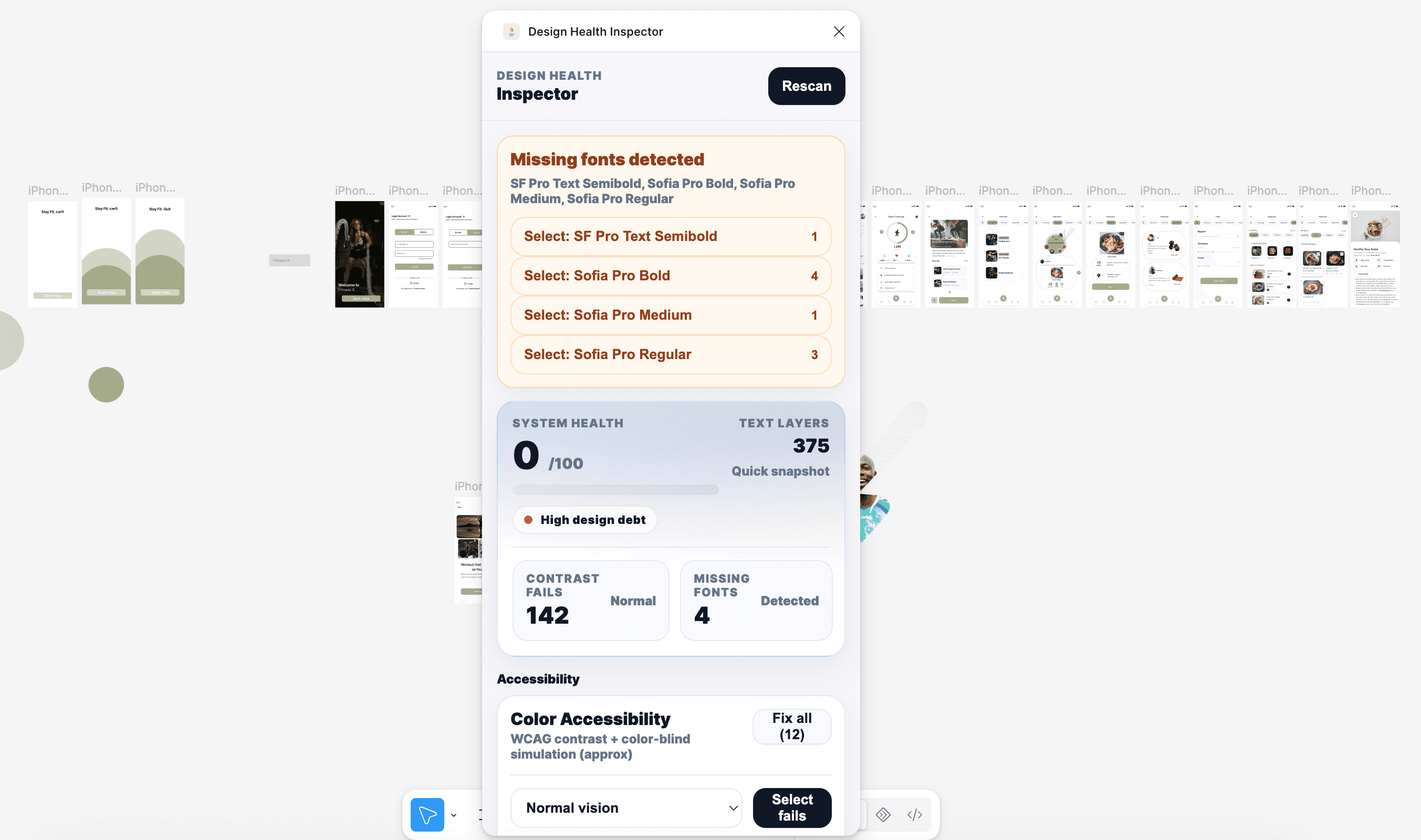
Design Health Inspector is a live, published Figma plugin available on the Figma Community. It automates four accessibility checks, WCAG contrast compliance, missing fonts, inconsistent type sizes, and color-blind accessibility risks that designers typically catch manually, too late, or not at all. The plugin runs entirely inside Figma, with no external tools. No context-switching. No accessibility expertise is required to interpret the results. Just a clear pass/fail for every check, with actionable guidance on how to fix what it finds.
Every designer knows accessibility matters. Most designers still catch contrast issues in QA, or not at all.
The reason isn't laziness. It's friction. Checking color contrast means leaving Figma, pasting values into an external tool, reading WCAG documentation, and then coming back to make the fix. That's four steps for what should be a one-second check. So it gets skipped and/or deferred, or noticed too late, when the cost of fixing it is much higher.
I ran into this repeatedly across my own projects. Working on the WaferWire design system, I'd find myself manually checking contrast ratios one by one. At GravityDrive, accessibility notes were a separate document that lived outside the design file.
The checks existed; they just happened at the wrong time, in the wrong place, in the wrong format. That's the problem I decided to solve.
Early versions of the plugin showed the full WCAG contrast ratio, the number, the threshold, the level (AA vs AAA), and the pass/fail. It was technically complete and accurately reflected the accessibility standard.
In testing with designers at different experience levels, the ratio number caused confusion and hesitation. Designers who weren't familiar with WCAG weren't sure what 3.2:1 meant relative to 4.5:1. They understood red and green. They didn't understand ratios.
I made the call to lead with the visual signal, color-coded pass/fail, and push the ratio to a secondary detail that appears on expansion. This meant sacrificing technical completeness in the primary view in favor of immediate clarity.
The result: designers used it without needing to learn anything first. That's the goal. A tool that requires training before it's useful has already failed.
The first decision was what to check. Accessibility is a broad topic; WCAG covers dozens of criteria across three conformance levels. Trying to audit everything would produce a tool so complex it would feel intimidating rather than helpful.
I narrowed the scope to four checks that addressed the most common issues I saw in real design files: color contrast failures (WCAG AA), missing fonts that create invisible text, inconsistent type sizes that break visual hierarchy, and color combinations that fail for the most common types of color blindness. These four covered the majority of issues that actually get flagged in accessibility audits, without overwhelming the user.
The plugin UI has very little going on, intentionally. A tool that a designer uses during their creative process needs to feel like a natural extension of that process, not an interruption. Heavy UI, lots of settings, complex navigation- all of that would make designers close it after one use.
I stripped every non-essential element. The plugin opens, runs, shows results, and gives you what you need to act. That's it. The minimal interface isn't a design constraint; it's the design.
The hardest UX challenge wasn't the checks themselves, it was the results. WCAG failure messages are technical. Ratio numbers, level designations, hex codes. Most designers don't have that context memorized, and they shouldn't need to.
I designed the output layer around three principles: immediate clarity (pass or fail, at a glance, before reading a single word), clear language (no jargon, "this text may be hard to read for users with low vision" instead of "fails WCAG 2.1 AA 4.5:1 contrast ratio"), and actionable guidance (not just what's wrong, but what to do next). The plugin tells you the issue and suggests the fix in the same view.
I used ChatGPT and Claude to help build the plugin logic, generating the JavaScript functions for WCAG contrast ratio calculation, the color-blind simulation algorithms, and the Figma Plugin API interactions. I then implemented, tested, and refined everything directly in VS Code.
This is the same AI-assisted development approach I used at WaferWire, using AI to generate production-ready code that I understand, own, and refine. The result is a published, working plugin on the Figma Community, not a prototype, not a mock-up.
Evaluates every text element against WCAG AA contrast requirements (4.5:1 for normal text, 3:1 for large text). Results are shown immediately with a clear pass/fail and the specific ratio, so designers know not just whether it fails, but by how much and what needs to change.
Scans the file for text layers using fonts that aren't available in the current Figma environment. Missing fonts create invisible text in handoff, engineers see a fallback font, not what the designer intended. This check surfaces those issues before they reach development.
Identifies rogue font sizes, text that doesn't match the defined type scale. One-off sizes quietly degrade design system quality over time. This check flags them so designers can standardize before the inconsistency compounds across the file.
Flags color combinations that fail for the most common types of color blindness, protanopia, deuteranopia, and tritanopia. Surfaces risks that standard contrast checks miss entirely, because a combination can pass WCAG contrast and still be indistinguishable for color-blind users.
Design Health Inspector is live on the Figma Community. Any designer in the world can install it, run it, and catch accessibility issues they would otherwise miss in seconds, without leaving Figma.
This project matters to my portfolio for a specific reason: it proves that I don't just design tools for other people to build. I saw a problem in my own workflow, defined it clearly, designed a solution with real UX thinking behind it, and shipped it as a working product.
That's the same muscle I use at work: identify the real problem, design with intention, and deliver something that actually functions. The only difference here is that I was the designer, the developer, and the user all at once.
Building a product entirely on your own is a different experience from designing inside a team. Every decision is yours, including the wrong ones. The most valuable lesson from this project was how hard it is to write clear error messages. Simple language that's accurate, specific, and not alarming is genuinely difficult to write. I went through at least six iterations of the contrast failure message before it felt right.
If I were to build v2, I'd add a file-wide scan. The current version checks selected elements, but the most powerful version would audit an entire file in one run and generate a summary report. I'd also add suggested fixes inline, not just flagging that a text element fails contrast, but suggesting the nearest compliant color from the existing palette.
This project gave me a new way to think about my design system work, too. The same principles that made this plugin useful- clear feedback, minimal friction, actionable output- are the same principles behind a good design system. Accessibility is just one form of quality. The plugin is a tool that makes quality visible.
How might we bring accessibility checks directly into the Figma design workflow, making it fast enough, clear enough, and frictionless enough that designers actually use it during design, not after?
#1 Defining The Scope
#3 Keeping it minimal on purpose
#2 Designing for designers who aren't accessibility experts
#4 Building with AI-assisted workflows
Feature 1: WCAG Contrast Check
Feature 2: Missing Font Detection
Feature 3: Typography Consistency Audit
Feature 4: Color-Blind Accessibility Check
What It Became
What I Learned & What's Next
2025
Figma Plugin API · JavaScript · CSS
Side Project




4
Accessibility checks automated
Published
Live on Figma Community
Impact at a glance
The Problem
How I Built It
Clarity Over Completeness
What It Checks
6. The Plugin
0
Tool-switching required