Building WaferWire's First Design System,
From Zero to Production in 15 Weeks
How I designed, built, and shipped a live brand hub with production-ready React, Tailwind & CSS tokens that eliminated manual handoff.
WaferWire Cloud Technologies
Before this system existed, designers and engineers at WaferWire were working from scattered assets, inconsistent UI patterns, and repeated manual requests. After launch, the Brand Hub became the single source of truth; developers referenced it directly instead of pulling files from design. Review cycles are shortened. Inconsistencies disappeared. And for the first time, the team could build new features without starting from scratch.
When I joined WaferWire, the product was growing fast, but the design foundation wasn't keeping up. There was no established design language. No shared component library. No documented standards for color, typography, or spacing.
The result? Every new feature started from scratch. Designers rebuilt the same buttons and cards repeatedly. Engineers made implementation decisions that drifted from design intent. And when a new team member joined, there was no single place to understand how the product was supposed to look and behave.
The inconsistencies were small on their own, a different shade of green here, a slightly different border radius there. But at scale, they added up to a product that felt fragmented rather than cohesive.
I started by auditing what existed. I pulled every screen, component, and color in use across the product and catalogued the inconsistencies. This audit became the brief, not a stakeholder document, but a live record of what was broken and what needed to be standardized first.
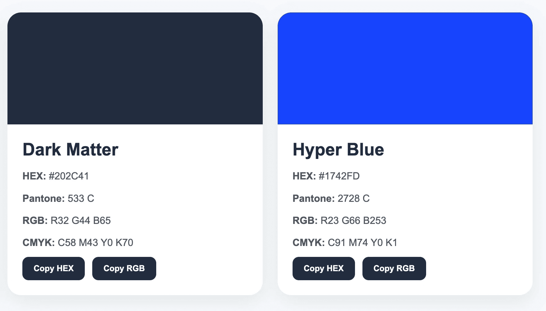
From there, I defined the core visual language: a structured color system with semantic tokens (primary, secondary, surface, feedback states), a typography scale with clear hierarchy, and a spacing system based on an 8pt grid. These weren't arbitrary decisions, each one was grounded in accessibility requirements (WCAG AA) and implementation constraints from the engineering team.
To bridge design and development, I didn't stop at Figma. I used AI-assisted workflows, specifically ChatGPT and Claude, to generate production-ready React component code and Tailwind utility classes based on the design tokens I had defined. I then implemented, tested, and refined these components directly in VS Code.
This meant the design system didn't just live in Figma; it shipped as real, working code. Developers didn't have to interpret designs or make implementation decisions. They had components they could drop in directly.
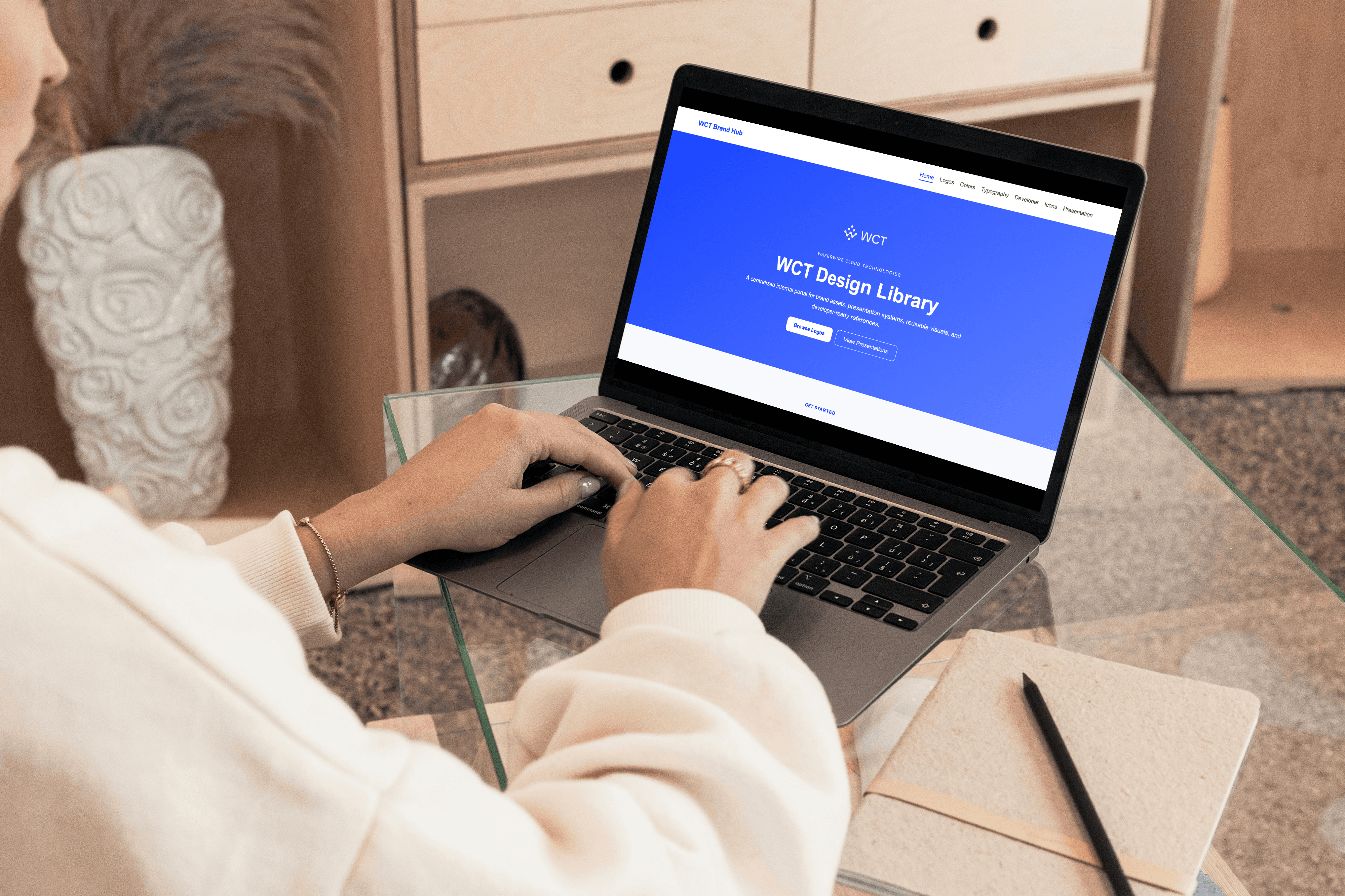
Early on, I made a key decision: this shouldn't be a Figma library that only designers use. It should be a Brand Hub, a live, navigable resource that serves designers, developers, marketers, and new team members equally.
I structured it into six sections: Logos, Colors, Typography, Icons, Developer, and Presentation. Each section was designed for its audience; the Developer section in particular went beyond visual assets to include production-ready code references, token documentation, and implementation guidance that engineers could use directly without needing to ask design.
With the foundation and code pipeline in place, I built the component library: buttons, form elements, navigation patterns, cards, modals, and feedback states- each documented with usage guidelines, accessibility notes, and do/don't examples.
Every component was built for scale: designed in Figma with variants and auto-layout, documented in Storybook, and shipped with Tailwind classes that matched the design tokens exactly. The goal was zero ambiguity; a developer picking up any component should know exactly how to use it without asking design.
The Developer section isn't documentation; it's a working reference engineers use directly. Every component ships in three formats, so implementation is copy-paste, not guesswork.
Every component- buttons, cards, and beyond- is documented in HTML, React, and Tailwind simultaneously. Engineers pick whichever format fits their stack and copy directly into production.
Color and spacing tokens ship as CSS variables, JSON, and a Tailwind config mapping, so the system plugs into any build pipeline without manual translation.
Default, disabled, and secondary states are documented for every component, removing guesswork during implementation and ensuring consistency across edge cases.
Alt text requirements, aria-label patterns, contrast rules, and keyboard focus states are documented inline; accessibility isn't an afterthought; it's part of the system itself.
Clear implementation rules, "Don't recreate brand spacing manually," "Don't hardcode random blues," prevent drift before it happens, keeping the system consistent as the team scales.
Halfway through the project, I made a call that significantly expanded the scope of this work: instead of stopping at a Figma component library, I pushed to make the system live, code-based, and accessible outside of design tools entirely.
The reasoning was simple. A design system that only lives in Figma is only half a system; engineers still have to interpret it, marketers can't access it, and new hires can't reference it without a license. It looks complete to a designer, but it's incomplete for the team.
So I built the Brand Hub as a live, navigable resource and used AI-assisted workflows to translate the design tokens into production-ready React components and Tailwind classes, which I then implemented and refined in VS Code.
This decision costs more time upfront. But it's the single reason manual handoff requests dropped to zero after launch. Engineers weren't getting better specs; they were getting working code they could drop straight into the product.
The Brand Hub launched at the end of week 15 and was adopted by the engineering team in the first sprint after launch.
The most immediate change: manual asset handoff requests dropped to zero. Engineers no longer needed to ask for design files, colors, or measurements; everything was in the Brand Hub, documented and ready to implement.
Across three product surfaces, the core product, the marketing site, and internal tooling- visual inconsistencies that had accumulated over months were resolved within weeks of the system going live. New components were built faster because engineers started from a consistent foundation rather than rebuilding from scratch.
For a company at WaferWire's stage, this wasn't just a design win. It was a velocity win for the whole team.
If I were starting this project again, I'd involve engineers earlier, ideally in week one, not week four. Some of the token naming conventions I chose initially had to be reworked because they didn't map cleanly to how the engineering team structured their codebase. Earlier collaboration would have saved a revision cycle.
I'd also build in a formal adoption checklist from the start, a structured way to onboard new team members to the system rather than relying on documentation alone. Systems only have value if people actually use them, and usage needs to be designed for, not assumed.
"A design system that only lives in Figma
is only half a system"
How might we establish a scalable design foundation that ensures visual consistency, accelerates development, and serves as a single source of truth for both designers and engineers, built from scratch, with no prior system to reference?
#Step 1 - Foundation
#Step 3 - Code
#Step 2 - Brand Hub
#Step 4 - Small Details
Feature 1: Multi-format code export
Feature 2: Live design tokens, multiple formats
Feature 3: Documented component states
Feature 3: Documented component states
Feature 4: Built-in accessibility guidance
Feature 5: Do / Don't rules
A Decision that Changed the Scope
What Changed
Reflection
Defining the core visual language
Building With AI + Code
Expanding scope beyond Figma
Components & Documentation
Why I expanded beyond a Figma library
From fragmented to a single source of truth
15 Weeks
Figma · React · Tailwind · CSS Tokens · ChatGPT · VS Code
Product Designer




Zero
Manual handoff requests after launch
15
Sprint 1
Zero
3
Weeks zero to production
Engineering adoption after launch
Manual handoff requests post-launch
Product surfaces made consistent
Impact at a glance
The Problem
How I Built It
A system built for how engineers actually work
3
Product surfaces made consistent